Description - There is pink, black, yellow, red, with splatters of blue, green, and what looks like purple.
Analysis - Most definitely contrast, positive space and negative space.
Interpretation - It has a sense of individualism because of his name in the artwork also the colors he used could possibly be colors he like and best defines him.
Judgement - It's very different and cultivating because of his various shapes of ideas to give the onlooker a chance for their own interpretation, sort of like an inkblot. The colors give this away and the motion of the brush strokes.
Tuesday, October 26, 2010
Monday, October 25, 2010
Enchantment by Marc Chagall

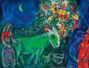
Description: Blue -Tranquility, Orange/Brown - Earth, Green - Fertility, Purple - Tranquility. I see a man and his wife, both blue. There's a small tree in the center. They consist of all the previously stated colors. A bird is at the edge of the tree. There is also a man in the middle of the trees. He appears to be old and he is holding an object in his hands. It appears that the purple in the tree are grapes?
Analysis: The elements of art that i think are most prominent in this artwork are color, shape and unity. There are only bright colors in this artwork. The artwork wants to instill happiness. While all the colors stand out brilliantly it seems like they just seem to blend in together. The obscure shapes of the people in the artwork make it seem unrealistic.
Interpretation: The people are probably blue because they are calm and happy. The man appears to be smiling. Grapes are supposed to symbolize luck and the green to me symbolizes fertility. Maybe he has been trying to impregnate the girl and finally succeded.? I think this could also explain why the dove to the left is green.
Judgement: This painting isnt really my style but i see the hardwork that was put into it. It uses colors marvelously while instilling a sense of happiness and peace. I could see it hanging in a museum somewhere but i dont really like it. A great painting nonetheless
Homework #8

Purple: relaxation
Green: money
Burnt orange: sunset
Brown:
White: Pure
Description: In this picture their is man with a orange violin in his hand. Standing on top of a black and brown buildings with a brown puppy reaching at the man's purple jacket. To the right of the man their is a small man with some kind of wond in his hand . And at the top theirs two building with an angel flying through the foggy sky.
Analysis: In this picture the Elements of Arts and Principle of Design are line, contrast,and shape. To me the artist was setting a mood for Christmas carols with the contrast color green face man with the burnt orange violin. Also the white snow in the backgound gave it a winter season look with the red outfit the angel was wearing while flying through the sky.
Interpretation: What it mean to me? To me this picture the green face man was playing Christmas carols for the city for entertainment or even money. And his puppy was enjoying it.
Judgement: To me this is a nice print. The artist used a of colors, contrast, and lines. With the man's purple jacket gave it and good indication that it was winter. the foggy grey sky with the red oufit angel flying through the sky.
My Critique-Marc Chagall

Description: In this painting by Marc Chagall, I see the colors, yellow, red, blue, white, and green. The dominant colors of this painting, that stand out are yellow, red, and blue. White and green serve as accent colors. The color yellow signifies happiness, like a "smiley face". Red means fire, passion, love, and/or desire. Blue is a calming color, that could signify loyalty and trust. Even though the white and green are accent colors in this painting, they still have meaning. White signifies purity and green signifies growth and fertility. The objects in this painting are a blue dancing couple, a red bird, yellow and white daisies, a red and yellow tablecloth, a bowl of fruit, and in the background, a night time window. I believe the artist uses color in a very symbolic manner.
Analysis: The different Elements of Art and Principles of Design that stand out in this painting are Color, Contrast, Variety, Texture, and Proportion. First of all, the artist catches the attention of the audience by the use of variety in color. The colors, red and blue, "pop" from the overall yellow background. Once the audience is hooked, the contrast in texture keeps the the attention of the audience. The soft, feathery texture of the flowers contrasts with the more hard, rigid lines of the floor and the table cloth. This keeps the eyes of the audience moving from one object to the next. Proportion also plays a big role in this artwork. The size of the red bird and the bouquet of flowers are quite large in comparison to the dancing couple, almost overpowering the entire artwork. Even though this painting has a realistic setting, the difference in proportion, unrealistic use of color, and the lack of detail gives the audience the idea that the painting is not an actual event, but that the artist is reminiscing or dreaming.
Interpretation: I think the artist's use of color and proportion, used in the painting, symbolizes this couple's overabundant joy and love for one another. Yellow exhibits joy and happiness the couple share. Along with red, which signifies their love, passion, and desire for one another. The couple being colored blue and being so closely intertwined, signifies trust and loyalty they have with each other. White of the flowers symbolize the purity of the union of the couple, and green, meaning growth and fertility. The flowers and fruit also symbolizes growth, and possibly fertility the couple desired. You can not help but feel the passion and love that this "blue couple" share. I believe the artist wanted to portray a beautiful, flourishing romantic relationship. He obviously was very passionate about the couple in this painting
Judgement: This style of painting is not my favorite. I would tend to lean more towards a painting that has more subtle colors and maybe a little more realistic feeling. The bright colors definitely got my attention and peaked my curiosity. I do appreciate the artist's passion he has exhibited with the artwork. I always enjoy a love story!
HW # 8
Blue --> water, moon, sad, life
Red --> blood, love, anger, evil, life
Pink --> happiness, peace
Yellow --> peace, sun, light, sunflower, lemons
Orange --> fruit, peace
Black --> night, evil, demon
The objects I see in this painting are: a donkey, chicken, water pale, two women, a man, a little boy, a tree with bloomed flowers, houses, and the moon. I think the artist was trying to tell us a story using theses colors on certain objects, such as the orange and yellow and reds on the tree I think he was trying to represent life, the red on the women might resemble her as being full of evil, and the donkey being green might represent the nutrients he/she has taken in.
Analysis: There are many Elements of Art and Principles of Design in this artwork, but only a few of them stand out to me, I am able to remember them later on in the day. So the ones I remember are: contrast, color, and proportion. The way that the artist made, the objects real life size, makes you feel like you can walk in the picture and feel normal.The contrasts in colors make certain things like the women, the man, the boy, the chicken, and donkey stand out, from the sky and dark houses.The colors give you a sense of emotion and roles the objects played, the red of the women might mean she plays an evil part where as the blue of the man might say that he represents normal life.
Interpretation: To me this artwork represents a Biblical story, the beginning of life. The red women and blue man represent Adam and Eve and the colorful tree behind them was the tree of life, or the forbidden tree that they ate from so the red in Eve would represent the sin she committed. The other women to me would represent Mary when she was pregnant with baby Jesus and the donkey would be what she rode on. The houses in the back of the painting could represent where Jesus was born or the city Mary was fleeing from. And the dark blue in the back ground could represent night time, which is when Jesus was born.
Judgment: To me this is an amazing painting, pretty much because the Elements of Art and Principle of Design brought out this very emotional, touching, biblical story. I believe its a good way to learn without having to have the words to tell the story, because the pictures are bold enough to do it by themselves. I know this is a piece of artwork that I would hang in my house.
Thursday, October 21, 2010
HOMEWORK #8
FORGIVE ME - I gave you guys the wrong artist's name in class - I was rushing to get through!!! Do a Google Search for the artist "MARC CHAGALL" and you will see artworks by the same artist we critiqued today. Choose an artwork by this artist, upload the image to YOUR OWN NEW POST (just like in Homework #5) and then complete as FULL FORMAL CRITIQUE. This time I WILL be grading you based on using complete sentences and proper grammar. Remember to FULLY develop Steps 1 & 2 (Description and Analysis) before jumping to the Interpretation and to REFERENCE the colors, objects, and Elements of Art you mention in Steps 1 & 2 when telling me your Interpretation. Here is the type of sentence structure and format I want to see:

DESCRIPTION: In this painting I see the colors Green, Red, White, Blue, Yellow/Gold, Black and Brown. The most prominent colors are Red, Green, and White. I think the other colors were used as accent but don't seem important to me. The color green could represent envy, greed/$, growth, environmental issues, or being sick. The color red is usually associated with heat, love, a warning, blood, and evil. The color white is usually used to symbolize purity and innocence. The objects I see in this artwork as a man with a green face, a tree/plant in his hand, a goat/cow, a woman milking a cow, a farmer holding a scythe, a woman who appears to be upside down in the middle of the road and a skyline of some sort of town in the very background. It makes sense that the use of green here has a connection to growth and life because this appears to be a farm scene where produce and other goods are grown. However, it could also be used to show greed because some farmers do not have any reverence for the souls or feelings of the animals and only see them as a source of income. It also makes sense that the red in this painting represents blood because of the blood that is spilled on farms to make a living and feed that village/family. The big areas of white are mostly centered around the animal so I believe the artist was using it to represent the innocence of the animal who is sacrificing their life for the good of the farmer.
ANALYSIS: Although there are many Elements of Art and Principles of Design at play here, the ones that catch my attention first and stay with me even when I am not looking at the artwork are the use of Contrast, Color, Shapes and Proportions. The artist has shown contrast of color here to show the difference between the Farmer and his intentions and how these are very different than the sweet innocence of the animal. The colors all seem to be symbolic and mostly stick out in your mind because they are so randomly placed. Had this painting used realistic colors and values, it would not have as strong of a message. The shapes here also bring some consistency to the artwork and give it a dream-like quality. The shapes are simplified, most of them are curvy and not angular and I think it is also very symbolic that there appears to be the faintest outline of a circle in the dead center of the painting - also playing in to the meaning of the painting. Finally, the artist has chosen to skew the proportions on the objects so that they no longer look realistic. This enhances the dream like quality of the painting and also matches the use of shapes to tie all of the objects together.
INTERPRETATION: Based on the colors, objects, and most prominent Elements of Art, I would say this artwork is making a statement about living on a farm and the "rural" life. The colors green and brown have a direct connection to this type of setting and, although the red may represent blood shed from the animals on the farm, neither the farmer nor the animal seem to be sad or angry. The expressions on their faces leads me to believe they both understand that this is just part of the circle of life and they have respect for one another. I believe the farmer was painted green because he is the one who is "growing" the animals - even though he eventually kills the animals to feed himself and make a living, the animal would not survive on it's own without someone (the Farmer) to feed it and nurture it from birth to death. I also came to this conclusion because of the "tree of life" that the farmer is offering or feeding to the goat. Overall I think this is a nostalgic painting that is reflecting positively on the life of a farmer and the relationship they have with their animals and sacrifices that both make to keep the circle of life going.
JUDGEMENT: I really don't like this style of painting very much but I can appreciate the thought that went behind it. It is definitely eye catching because the bright green and red make you want to look at it further and the high contrast of the colors and values is not something you see everyday. Overall it may be a great painting to hang in a museum and/or highly contemporary home, but it is not my cup of tea!
Tuesday, October 19, 2010


Monday, October 18, 2010


Specht's Art Appreciation: HOMEWORK #7
Specht's Art Appreciation: HOMEWORK #7: "This one will, once again, force you to use this blog on a more advanced level but doesn't require as much brain power as the last one :-) A..."

Chris Hadnot-Contrast


Saturday, October 16, 2010


Thursday, October 14, 2010


HOMEWORK #7
This one will, once again, force you to use this blog on a more advanced level but doesn't require as much brain power as the last one :-) ALL YOU NEED TO DO is to photograph your 3 finished patterns and upload ALL THREE to your own "New Post." You will also need to label each one as either Unity, Variety, or Contrast.
Thursday, October 7, 2010
Individualism by Kingsix87
Description - The objects seem to be made of glass, opaque and transparent. The objects in the photograph are chess pieces used in the game, pawns. There's a checkered pattern below the objects, the colors are black and white. Beyond the objects and ground of which they sit, there is a void of darkness.
Analysis - Throughout the photograph there is Implied Texture; the objects in this photograph look rather smooth and possibly cold due to the fact that they're made of glass, Positive Space; the focus is on the pawns but one out of all stands out more in focus, Line; the checkered pattern make lines horizontal and vertical, Scale; given by the pawns being placed in line next to each other and makes it appear from far away and then up front or you could also say that the objects are blurry then gets clearer as it gets closer.
Interpretation - Out of all the others, there's always one that stands out from the rest. No one should be afraid to be different because of what other people say or how they might react, breaking the status quo isn't a crime, also even if they don't like the attention, the very same ones who are unique are bound to be discovered, effortlessly and regardlessly. The colors and focus mainly address this in the photograph.
Judgement - I think it is very good, it speaks from a powerful perspective using something as simplistic as pawns of a chess game. Very much so as well, the artist used a contained setting to not distract the viewer from the message at hand with anything else. To justify this, the colors were chosen carefully as well as the focal point
Jared W - Critique
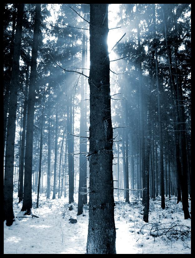
2. Analysis - The lines in this photo make it really catch the viewer's eye. While the photo has a great deal of contrast as well, the fact that the closest tree divides the photo in to two sections and that the sun rays are shining through the trees make line the primary element.
3. Interpretation - The image is rather mysterious. Looking at the photo it's like there is a light side (left) and a dark side (right), while directly behind the tree there is a bright glowing light. Kinda like there are two sides you can choose from, and the bright light is there to help lead the way. Or religiously speaking, the bright light could even represent "God" watching from above, waiting to see which side you choose. His (God's), where he gives you light to help you see where you're going, or the darker more complicated route.
4. Judgement - At first this photo just looked like picture someone took of the woods in the winter and didn't seem really special, but after looking at it closer there is a lot more to the photo. The way that one tree divides the image and one side has light shining through and the other doesn't just amazes me. It's even cooler that there are so many ways you can interpret it.
Shark chasing squid

Description: In this painting I noticed a slash of blue ending in an explosion of black on a field of white. In the center I notice a blue shark and five tiny squid attempting to flee from the attacking shark.
Analysis: Large organic flowing lines of blue and black, with a contrast of smaller black, detailing lines to show direction, texture of turbulence and energy. Value is shown within the wash of blue and black.
Interpretation: I believe the painting is showing that through many, a larger attacking force can be avoided. If there was only one squid the ink cloud would be much smaller, ending up as lunch. The shark being the large attacking force and the large ink cloud a deturent produced by the many squid. The textured use of line showes the tubulence and speed of the pursuit.
Judgement: I enjoyed this piece due to simple use of line and color. The contrast of space and color grabs the audience attention to focus on the finer detail, leading ones eye to the smaller less prominent squid.
Wednesday, October 6, 2010
HOMEWORK #6
For this blog assignment, you will be required to start a conversation with a classmate on the blog. ALL students are expected to post their own artwork critique by noon on Friday and now you are ALL also required to COMMENT on one of your classmates' blog posts. Don't treat this assignment lightly - i.e. I don't want everyone commenting on Shelby's photo of the dag "Awww, how cute!" THAT'S NOT ENOUGH! I want to see how much you have learned in this class - comment on the other Elements of Art and Principles of Design you see in your classmates' chosen artworks or disagree with their interpretation of the artwork...anything that shows THOUGHT and EFFORT and uses some of the vocabulary learned in class. Your goal with this and other assignments it to learn how to talk about art in a fluent manner. Good luck!
Thursday, September 30, 2010
My Critique

Descripation- In this picture I see a white skin women wearing a light grey 3/4 inch blouse, with charcoal jeans with white fades, and with low brown pumps.
Analysis- In this picture the contrast would be the wrinkles in her shirt. It give it a look like her shirt is wrinkles in the middle and on the arm of her shirt. The background is a light grey with her shadow.
Interpretation- In this picture I think she was some kind of model posing in a light grey setting, with a light grey 3/4 inch shirt to match, charcoal jeans with whites fades, and with low brown pumps . And they had her to strike a post with both of her hands on her hips with her right knee bent toward her left knee on her right tippy toe.
Judgement- In this picture I think she in a nice background, and the outfit she was wearing was nice for the photo shoot for the accusation.
Tuesday, October 5, 2010

(Sorry i tried to make it smaller but it didn't work)
Description: Large windows, bright lights, chair, person, tile floor.
Interpretation: The high contrast makes the lines more prominent. The tiles also have lines drawing the attention to the center, not the man sitting.
Judgement: The picture shows patience or maybe the emptiness at perhaps an airport..? It demonstrates patience. Whether its patience to wait for family to arrive or for a plane to take you to your family or some sort of business. It could also demonstrate emptiness. There is nobody else there but the one person.
Monday, October 4, 2010
Elizabeth Ray 1301

Description : The different shades of gray, black and white bring out the different objects such as the girl, the dog, the staircase, streetlight, gates ,castle, book,evil knight, buttons, cracks in the girl's face, crows and the fog. The pink on the book brings out the heart symbol, which may symbolize either love or life. Unlike the black and grayish colors which might symbolize evil or death.
Analysis : The contrast in thickness of the lines make certain features of the artwork stick out, such as the staircase or the designs on the gate or her clothes or the structure of the castle and its windows, or the cuts on the girl's face. The contrast in texture such as the thick/light lines on her face make it seem like its rough and broken , its almost like you can touch it and feel the roughness. The contrast in color such as the black and whitish-gray makes her eyes pop/making them stand out, same for the contrast of the white and the gray that form her mouth.
Interpretation : When i look at it, It makes me think of a women who has or is sacrificing her beauty to sace either her kingdom or someone she loves. The cracks like marks on her face make it seem like she is broken , which takes the beauty away from her making her somewhat ugly to look at. The evil knight figure holding the book tattooed with a heart symbolizes to me a powerful wizard or the devil in which she made a deal with , the book could symbolize stolen soles or beauty or love even.
Judgment: I think it is a great piece of art work. The contrast in all the lines, colors, and texture really make you feel like you are there. It lets you feel whats going on in the art work and maybe how the girl is feeling inside. It really makes you think about why the artist painted what he/she did and maybe what they might of been feeling at the time.
Liz Pierce - Critique

Description - Train tracks, bridge, trees, leaves, sidewalks
Analysis - The main character of this photograph is line. The darker horizontal lines of the tracks make them appear very close. The smaller, lighter, horizontal lines of the tracks appear to be much further away. The vertical lines of the track and sidewalk move your eyes to a focal point. That being the brighter scenery at the end of the bridge. Contrast in texture and value also play a part. The darker leaves over the bridge contrast with the lighter trees in the scenery at the end of the bridge. All of the leaves add a softer texture to the picture, in contrast with the smooth hard lines of the tracks.
Interpretation - This picture almost gives me the feeling of the old saying, "The light at the end of a tunnel". It gives me the inclination of someone traveling down a dark or lost road that seems it leads to nowhere. But they are finally crossing a bridge that leads to a new place, possibly a more prosperous place in their life. A brighter future appears to be ahead.
Judgement - I like this picture very much. I like black and white photography. I think it makes you focus on certain aspects of a picture than if it were in color. I look at this picture on a personal level. Going to college is my bridge. My bridge to a whole new world of opportunity for me and my family. A brighter future is lying just ahead!
Subscribe to:
Comments (Atom)